WayFit – Designing a Smart Fitness App for Real-Life Goals
WayFit is a fitness and health tracking app designed to support users through real-time feedback, goal-oriented tracking, and adaptive nutrition suggestions.
This case study explores how I approached the UX structure, visual direction, and product logic to create a seamless and motivating user journey, tailored for users with different fitness goals.
1. Turning Research Into Actionable Design
Inspired by behavioral patterns around fitness drop-off and habit fatigue, I designed WayFit to be simple yet emotionally engaging.
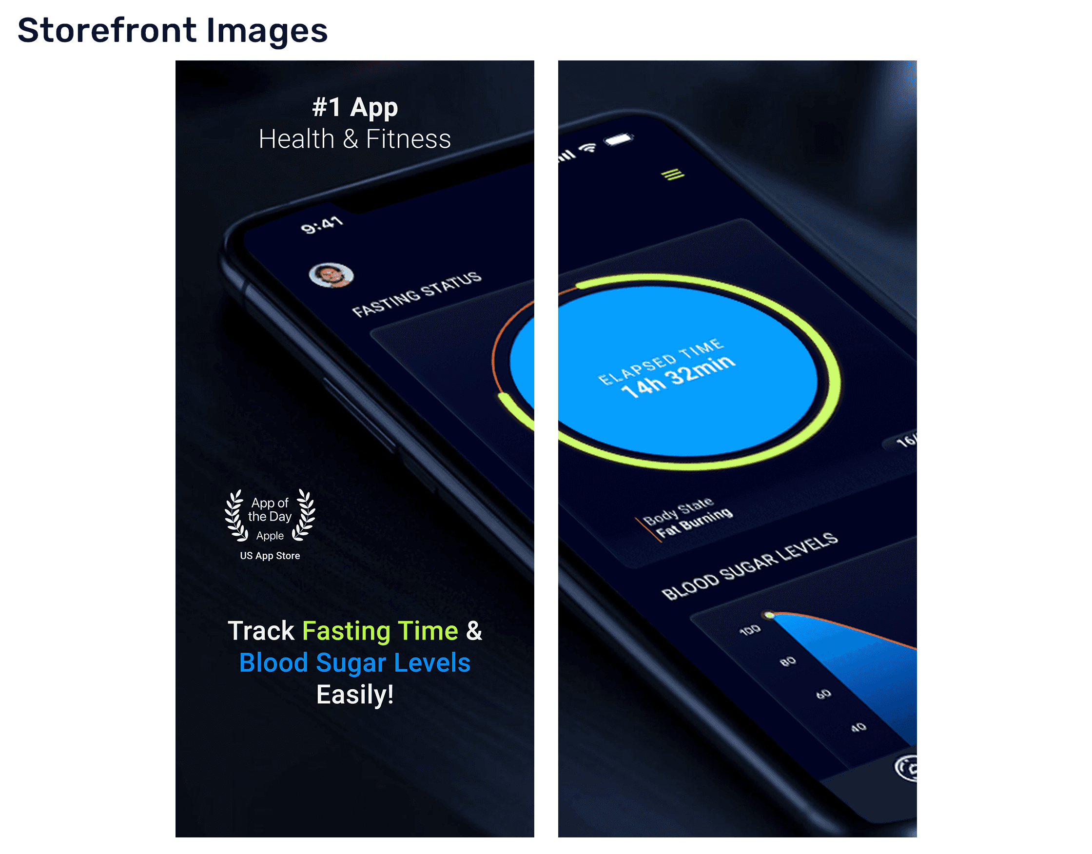
Key features like a real-time fasting tracker, an AI-powered meal scanner, and goal-based workouts were defined through interviews and user journey mapping.
The interface had to feel strong and energizing, not overwhelming.

2. Designing for Energy, Focus & Flow
I leaned into bold typography, dark UI for better focus, and accent colors to mark progress visually.
Features like custom fitness plans, syncing with health apps, and responsive feedback were designed to feel empowering, not intrusive.
The visual direction — sharp, slightly futuristic — aligns with the tone of a modern, data-friendly fitness product.